A new update of the web app has been published. As always, we have been very exigent with ourselves, and aim to give you a better, faster and more reliable experience with BulldozAIR.
Today, we released a more “graphical” update. The old interface, after almost two years of loyal services, has deserved a good redesign!
Here is a list of what has been changed:
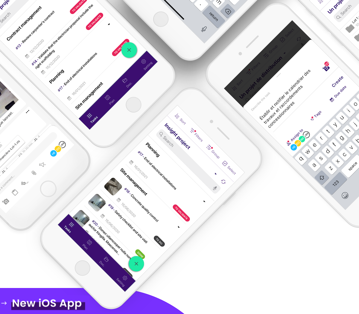
The color scheme and the icons have been reviewed overall. Now, we follow the material guidelines, in terms of color and placement.
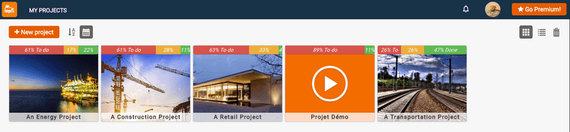
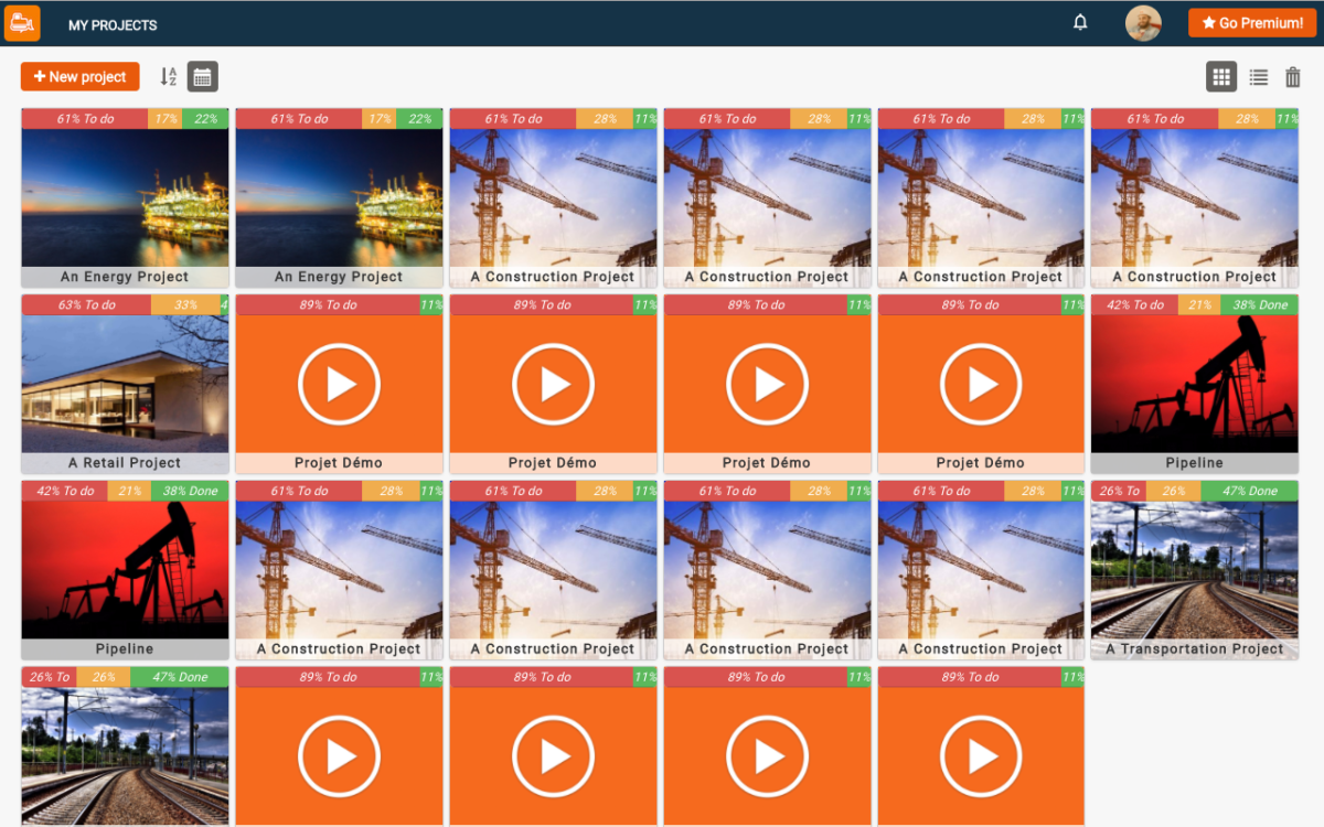
You can now view the overall progress of your projects from the project list, with neat little progress bars displaying the percentage and total of your notes status (todo, submitted, or done). There is also the possibility of viewing the progress by tag, from the tag list!
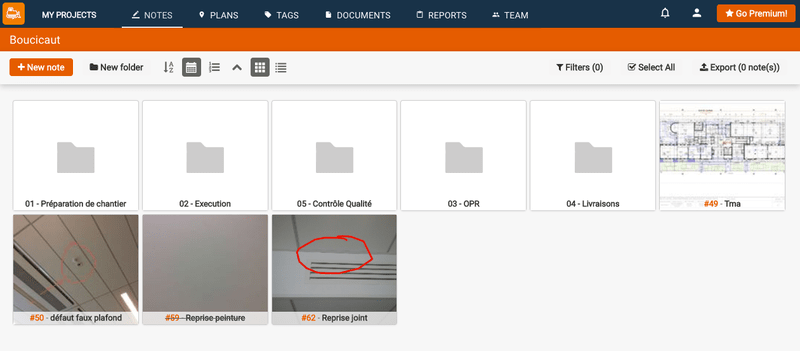
Exit the sidebar! Now, you can access your notes, plans, tags and documents via the very neat new top bar! That way, no more space is lost, and the content takes as much space as available on your screen.
On all screens, the top bar and toolbars are now fixed to the top, so that you can perform actions even when scrolled several thousands of elements!

It is now possible to search for plans, documents and tags straight from the toolbar on each screen.
The notification menu and user menu have been redesigned, making the app more convenient.
Hallo! BulldozAIR is now available in German! You can switch language from your account edit page.
As always, plenty of minor bugs have been fixed, and a lot of little performance improvements have been made to be sure to offer you the fastest experience possible.
We are very excited to have your feedback on these new features, you can check it out here. We rely on your feedback to improve BulldozAIR every day, so do not hesitate to tell us what you think! And if that is not already done, please enjoy 30 days of free trial, click here.